


Blogs
Services
Web Development 30 Jul 2025
What Is Responsive Web Design? Why It Matters in 2025

Writen by Tech Contributors
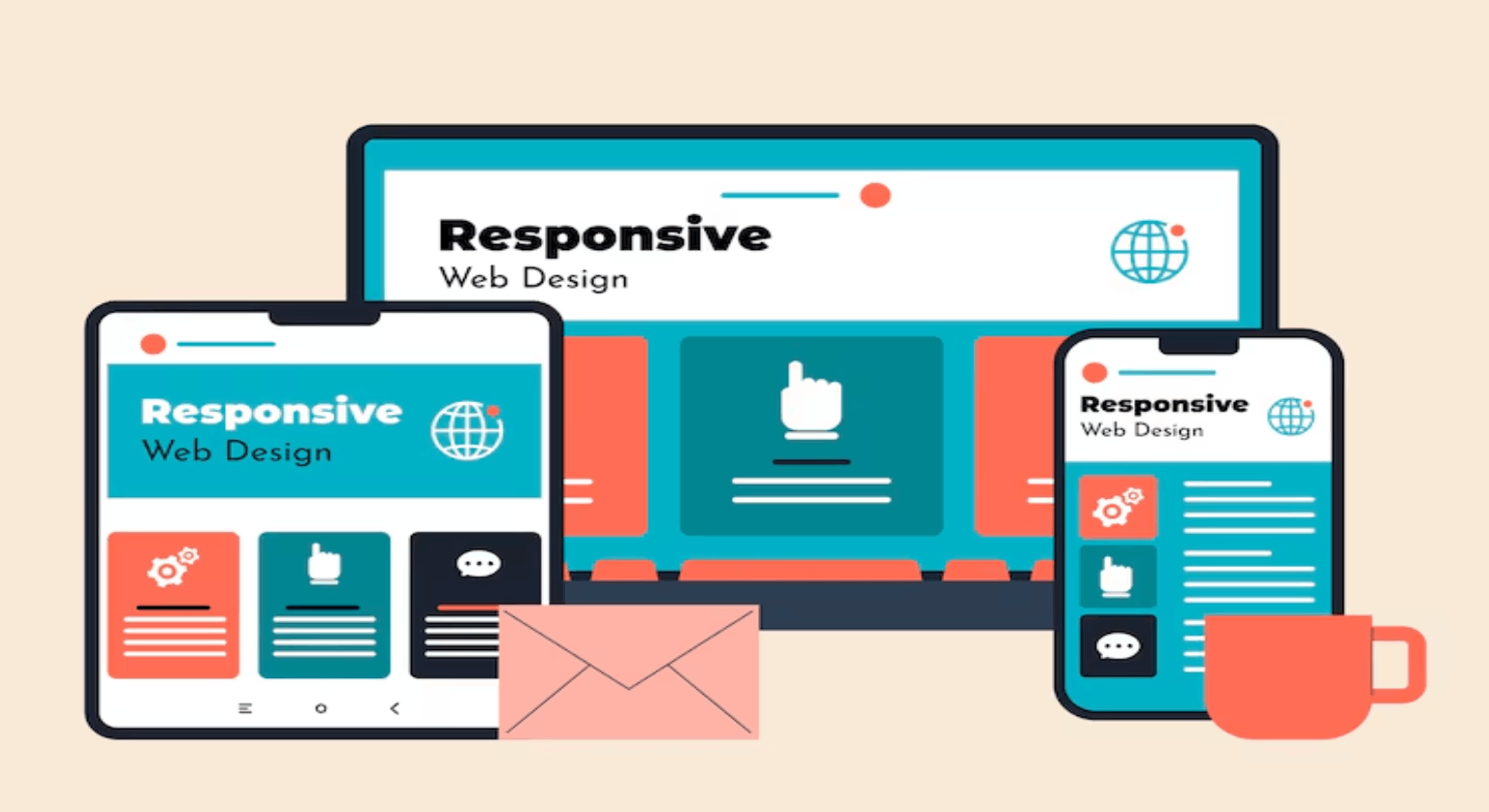
What is Responsive Web Design?
Responsive web design is an approach where a website automatically adapts to different screen sizes and devices. It ensures content looks great and functions well on desktops, tablets, and mobile phones.
A responsive website uses flexible layouts, fluid grids, and media queries to provide a seamless user experience across devices.
Why Is Responsive Design Important in 2025?
In 2025, over 75% of internet users are browsing on mobile. If your website isn’t responsive, you’re losing visitors, leads, and ranking potential.
Key reasons it matters:
- Google prioritizes mobile-friendly websites
- Better user engagement and lower bounce rates
- Faster loading across devices
- Higher conversions and accessibility
How Does Responsive Web Design Work?
Responsive websites adjust layout elements like text, images, buttons, and navigation based on screen size using CSS media queries.
Core elements:
- Fluid Grids: Proportional layouts instead of fixed pixels
- Flexible Images: Resize automatically to fit containers
- Media Queries: CSS rules that trigger layout changes based on device size
Benefits of Responsive Web Design
- Improved SEO (Google’s mobile-first indexing)
- Consistent user experience across all devices
- Lower maintenance (single site vs. multiple versions)
- Increased conversions and better accessibility
How to Check if a Website is Responsive
- Use browser’s developer tools > mobile view
- Google’s Mobile-Friendly Test: https://search.google.com/test/mobile-friendly
- Resize browser window — content should adapt without breaking
What Happens If a Website Is Not Responsive?
A non-responsive website may:
- Load slowly on mobile
- Display broken layouts or unreadable content
- Lose rankings in Google
- Drive users away due to poor experience
Is Responsive Design Still Relevant in 2025?
Absolutely. As new devices emerge (foldables, wearables), responsive design ensures future compatibility without constant redesigns. It’s not optional — it’s expected.
Struggling with design, speed, or SEO on your site?
We help businesses like yours build fast, beautiful, and high-converting websites.
👉 Contact Us Today — Let’s turn your website into a growth engine.
FAQs
We’ve answered the most common questions to help you better understand this topic. Get clear insights before making any decisions.
The main purpose of responsive web design is to ensure websites work and look great on all devices — desktops, tablets, and mobiles — without needing separate versions.
Responsive design provides smoother navigation, readable content, and faster loading times across devices. This reduces bounce rate and improves engagement.
Yes, responsive design is critical for SEO. Google uses mobile-first indexing, meaning it ranks sites based on mobile experience — responsive design directly impacts that.
Responsive design uses HTML5, CSS3 media queries, flexible grids, and responsive images to adapt the layout based on screen size.
You can use Google’s Mobile-Friendly Test or simply resize your browser window. If your layout adjusts without breaking, it's responsive.
Yes. A mobile-friendly site may work on phones but isn’t always truly responsive. Responsive design dynamically adapts to all screen sizes, not just mobile.
Absolutely. In 2025, with most users on mobile and new screen types (foldables, wearables), responsive design is essential for usability and growth.