In 2025, the term “mobile-first design” isn’t just a trend — it’s a business necessity. With over 74% of global internet traffic now coming from mobile devices and Google indexing mobile-first by default, ignoring mobile users is equivalent to shutting your doors to potential clients.
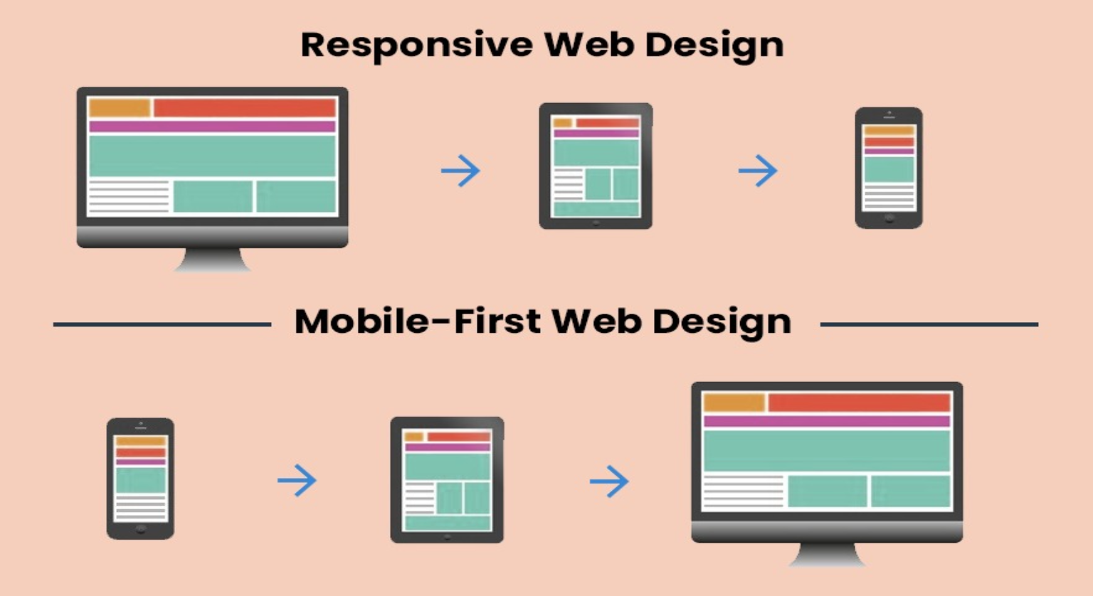
Consumers now expect fast, clean, and intuitive mobile experiences. If your website isn’t designed with mobile in mind, you’re already behind your competitors. A mobile-first website doesn’t mean a smaller version of your desktop site — it means designing for the smallest screen first, then expanding to larger devices.
In this comprehensive guide, we’ll walk through why mobile-first design matters in 2025, the key principles behind it, the best tools to use, and how to implement it with precision to attract traffic, increase engagement, and convert users into customers.
The Rise of Mobile-First: A 2025 Landscape
In the early days of the internet, websites were created for desktop users and adjusted to fit mobile screens later using responsive design. But now, that order is reversed.
Google’s mobile-first indexing means that your mobile version is the default version of your site in the eyes of the search engine. If your mobile site lacks speed, structure, or usability — your rankings, conversions, and revenue will suffer.
Here’s what’s changed in 2025:
- Mobile-UX signals are prioritized in ranking algorithms
- Core Web Vitals, especially on mobile, directly impact visibility
- Consumers are making more buying decisions on smartphones than desktops
- Local and voice search (via mobile) have exploded
- Mobile-optimized sites now outperform desktop-first sites in terms of conversions
Key Principles of Mobile-First Web Design in 2025
1. Content-First, Not Chrome-First
Mobile-first means prioritizing content clarity over aesthetics. Your most valuable content — headlines, CTA buttons, offers — should appear first and be easy to read without zooming or scrolling.
2. Speed is Everything
Speed isn’t a luxury — it’s a ranking factor. Google recommends a page load time of under 2.5 seconds, but the real-world benchmark in 2025 is 1.5 seconds or less.
To achieve this:
- Use lazy loading for images and videos
- Optimize all images with next-gen formats (WebP, AVIF)
- Eliminate render-blocking resources
- Use a CDN to serve assets fast across regions
3. Minimal UI, Maximum Clarity
Small screens demand minimalism. That means:
- Clean layout
- Large tap-friendly buttons
- 1–2 column layouts
- No clutter, no carousels, no distractions
Use F-shaped or Z-patterns to guide the eye.
4. Thumb-Friendly Navigation
In 2025, the average user scrolls using their thumb. Design with this in mind:
- Place primary CTAs and menu buttons within easy reach
- Avoid menus that require precision taps or multiple layers
- Sticky navigation bars with 2–3 simple icons perform best
5. Responsive Is Not Enough
Responsive websites adapt to mobile, but mobile-first websites are designed for it. Think beyond CSS breakpoints:
- Build with mobile grid systems from the start
- Load different layouts, not just resized elements
- Prioritize server-side optimization to reduce initial load on mobile devices
How to Build a Mobile-First Website in 2025 (Step-by-Step)
Step 1: Start With Mobile Wireframes
Use tools like Figma or Adobe XD to create wireframes focused on:
- Simplicity
- Content hierarchy
- Clear CTAs above the fold
Avoid thinking “What do I remove?” and instead ask “What do mobile users truly need first?”
Step 2: Write Mobile-Optimized Content
Keep paragraphs short (2–3 lines max), use clear headings, bullet points, and avoid jargon. Your headlines should explain value within 6 words.
Step 3: Use Scalable UI Frameworks
Choose frameworks that prioritize mobile-first components:
- Tailwind CSS
- Bootstrap 5+ (with mobile-first utility classes)
- Framer Motion or GSAP for lightweight animations
Step 4: Optimize Visual Assets
- Convert PNGs/JPEGs to WebP or AVIF
- Use SVGs for icons and illustrations
- Preload key assets to boost Largest Contentful Paint (LCP)
Step 5: Implement Progressive Enhancement
Design for the least powerful device first and enhance based on device capability:
- Default design = mobile with basic features
- Enhanced experience = larger screen with JavaScript extras
Mobile SEO and Technical Optimization
A mobile-first site isn’t complete until it’s technically optimized for search engines. Here’s what matters most in 2025:
- Mobile-first indexing compliance: Ensure the mobile version contains all critical content
- Structured Data (Schema Markup): Enhance visibility in AI overviews and SERPs
- Lazy Loading with Native HTML:
<img loading="lazy">boosts performance - Font Optimization: Use system fonts or preload custom fonts to prevent layout shifts
- No intrusive interstitials: Avoid popups that block core content on mobile
Tools to Build and Test Mobile-First Design in 2025
| Tool | Purpose |
|---|---|
| Google PageSpeed Insights | Core Web Vitals + Mobile performance |
| GTmetrix | In-depth load time analysis |
| Lighthouse (Chrome DevTools) | Mobile usability + accessibility |
| BrowserStack | Cross-device mobile testing |
| Web.dev | Mobile-first development guidelines |
Conclusion: Mobile-First is Not the Future — It’s the Now
In 2025, mobile-first design is no longer about keeping up. It’s about leading the pack, dominating search rankings, and converting modern users where they live — on mobile.
If your website isn’t optimized for mobile:
- You’ll lose rankings
- You’ll lose users
- You’ll lose revenue
But when done right, a mobile-first site will:
- Load instantly
- Guide users effortlessly
- Convert leads into clients
- Rank on page one of Google and appear in AI Overviews
🚀 Want Your Website to Be Mobile-First & Lead-Generating?
Tech Contributors specializes in building blazing-fast, mobile-first websites that don’t just look good — they generate qualified leads.
📲 Contact us now for a free mobile performance audit and turn your site into a lead magnet in 2025.